Categories
Blog

Why is Good UI Design the Prime need for a business website?

If you ever found yourself on some website where you get pretty confused about what they are offering to you or getting some difficulty navigating through the pages, what will you do in response? It’s simple, you will leave the site and jump on another site for a better experience.

The bad user interface can be the downfall of your business and If you rely on the internet for your business then it gets crucial to ensure you are up to speed with your competition.

According to a research, a well designed user interface can increase the site’s conversion rates by around 200%; however, interactive user experience can yield 400% conversion rates, which is overwhelming, Hence when the brands understand the metric they tend to adopt it faster.

A lot of companies don’t understand how important UI is for their business websites and we are here to make sure that you do understand how important it is to have a well-designed UI for your business website.

UI Design is one reason that your site will begin to see a rush in your traffic. It attracts users and keeps them there. It is what makes people recommend your site to others and become loyal clients.

Even the small changes in your UI design can impact your website in a major way. How your button looks in design also decides whether the user will click on it or not. It should be your top priority when people visit your site they should get the best user experience. When users have a decent experience on your site, the conversion rates will get higher and they will in general recommend more people regarding it. This implies that you will get more chances to increase your sales and considerably higher chances to develop your customer base. At the point when people get an awful experience on your site, the odds of your product or company being rejected increases.

Basically, UI Design is important for your business because without it you will probably just make cold pitches. People make snap decisions and they would rather wait for 30 seconds to load a well-designed website than meddling around on a difficult one. If your client base finds your site excessively complicated, confusing, or hard to use/explore then an amazing product can also fail. We can say that User Interface Design is important because it can make or break your client base.

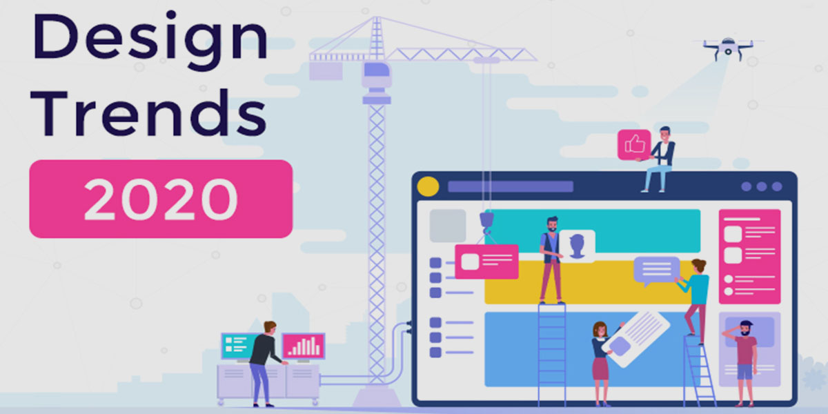
To make things simpler, here are some master tips for developing a great User Interface on the website:

  1. Simple Design

Fancy designs and multiple interfaces might look tempting, but it can be confusing for the users. But when you stick to the simple design, your target audience can see what your products or services you are offering to them clearly. Fancy designs can probably cover your underlying purpose. Using simple design is a great method to expand your User Interface Design.

  1. The power of good visuals

Never underestimate the power of good visuals like amazing images and unique typography. This can be a game-changer also. Great images and typography will definitely leave an impression of your site in users’ minds.

  1. Effectively Insert physical components

Physical parts of a UI design like buttons/icons help to grab the attention of the user and naturally make the urge to tap on them. Using these kinds of components will provoke users to click on the Call to actions button as they unconsciously bring out the child in us.

  1. Communication is the key

When something goes right, or wrong, the user should have the option to tell. Make sure that your site communicates effectively with your users. You can include default options, pre-filled forms and more. Consider what you would need if you visited your site. Furthermore, ensure that things are worded clearly in a way that everyone can understand. Keep it short and sweet and stick to your point.

  1. Make space for your cell phones

Since the screen proportions of mobiles and desktop are different, it is better if you design separate versions of your site. Even Google’s most recent updates strongly suggest the mobile-first strategy, as it also affects SEO.

UI or UX, our purpose is to offer the best suitable, appropriate for conversion website interfaces. At the same time we work on creating the value based sites which are technically powerful and visually appealing. To know more about our works or portfolio, write to us. You can also request a proposal here.

Categories
Blog

Pros and Cons of Free Website Builders

In old times creating a website used to be much more complicated. It required a great deal of time and hard work, a lot of creativity, and a broad knowledge in coding. If you have money, you could hire a website developer to work for you.

Things evolved with the startup boom and digitisation of services. Automation was making its place and smartphones were making the entrepreneurs tech savvy. Therefore in case you didn’t have that much money, you can still make a website for yourself. Thanks to the rise of website builders, building your dream website is possible now. It is simpler and less expensive than ever.

Websites like Weebly, Squarespace, Weblium and Wix offer platforms where users can construct their own websites for nothing or at very cheap cost.

All you need is to choose from one of their themes, drag or drop some layouts and that’s it your website is good to go! But what’s the catch? Below you will find some pros and cons of website builders that business owners should know.

The Pros of Using Website Builders No Coding Skills Required

The first advantage of using a website builder is that coding skills are not required.

You don’t need the help of experts.

You don’t have to become familiar with the nuts and bolts of coding. These projects are deliberately made for people who know nothing about coding.

Less Expensive and Fast

Website builders are incredible for those who are just starting on their first website or those who simply need to make a personal blog for random posts.

Website builders are less expensive than hiring a web developer. You can spare a lot of money. You don’t need to wait too long either. You can make your own website as fast as in just 30 minutes.

No Design Skills Required

Business or Personal, websites need to look amazing. There is a need to follow some kind of theme or style for it to look visually appealing. Website builders don’t promise to make the most attractive webpage, but still their styles are decent enough to draw you visitors.

The Cons of Using Website Builders Not Very Suitable for Professional Business

Business websites need to have a quality structure, SEO coding, and professional features. The first impression is the last impression and it is possible that the user will never visit your website again if you have a cheap looking web design.

Your site’s design is just not for the aesthetic purpose. According to a study, 48% of people believe that site design is the main factor in designing credibility. So if your purpose of making a website is for your business, then you should recruit a website developer for better quality and visual style.


Not Custom Designed

If you need a great website, you need the experience of a PRO. Most website builders don’t let you do custom designing. Their free templates look non-specific, may not work properly on cell phones, and have no extra SEO features. Plus, most of the time you cannot add something extra for effectiveness. They basically feel and look inadequate in case you’re aiming for much more professional design.

At 17 Geeks, we offer customizations in all aspects of website design and development.

Slow Loading Time

While the vibe of your site has a great deal to state about your believability, it isn’t all that matters. You additionally need a website that will stack quick. Destinations manufactured utilizing free website builders load excessively gradually contrasted with all the more unequivocally constructed websites on paid stages.

Poor SEO

Unstructured and messy codes are normal among website builders. This is harmful for your on-page SEO, which is important to rank better in search engines like Google. The thing is, the point at which you construct your web page with website builders, you don’t have control of the code. Google likes those websites that are well organised and follow a specific chain of hierarchy or category. And it is important to make Google happy to rank high on its search engine.

Restricted Pages

A free website builder account has a limit on the number of pages you’re allowed to create. A few website builders will allow up to five pages, while some would even give you only a couple. And everyone knows how little content also means less keywords which is equal to few searches and very less visitors. People want to read on sites that are frequently updated and growing continuously.

Bad Customer Service

Free website builders don’t come along with the best customer care service so if you are experiencing some specialized issue, you can say that you are on your own. The only way out is that you can ask for advice on the forums or pray that their support team will miraculously answer your email.

We can say that website builders are the absolute most modern but complicated tools on the internet. But just like how you will hire a carpenter to make your furniture, it is worth every single rupees to hire a web designer to design your website. However,if you want to make a website just for your personal blogs and random posts – using a website builder can be the wisest option for you.

Categories
Blog

07 Web Design Trends in 2020

Web design for your business is responsible for almost 95% of a visitor’s first impression about your positioning, values, capacity, strengths. A great design can also help you in increasing your sales.

That’s why you should give more importance to modern and updated website design development in your marketing strategy.

But do you know what modern website designs you should look for in 2020 and how can you use them to give a fresh look to your website?

If you’re a creative business owner, inclined towards design or a fan of great design, you’re in luck. Because here are the top web design trends that you will mostly see on your screens in 2020.

  1. Oversized type and elements
    In order to convey clearly and quickly, website designers are preferring large, implying elements. This magnitude in your website design can apply to pretty much anything on a webpage, from big, bold typography, to fullscreen pictures and recordings, and even larger than usual website menu icons.

Enlarged elements are eye-catchy, and help site visitors to understand what the site’s everything about immediately. Also, they look great on any screen size. But keep in mind that a large number of grand features can be overwhelming and counterproductive.

  1. Split screen content
    Have more than one plan to pass on, yet at the same time need to hold a cleaned-up look? Think about dividing your screen into halves, allowing each side an equal spot in the limelight.

This dazzling web design trend breaks the rectangular mold in two. Also, for a scramble of extra energy, you can make every half of the screen act differently. For instance, toss some surprising asymmetry in with the general mish-mash by messing with scroll impacts and making each side move at an alternate pace.

To inject visual hierarchy into this split design, place an extra element at the centre of the screen, where the two parts meet. Those elements could be anything from your logo to a call to action (CTA) button or a menu header, this will help to balance out the screen.

This is also powerful to establish the attention spans and weightage on the website design.

  1. Solid Color Blocks
    Proceeding on the split-screen pattern, a few websites separate their content into even more parts, which bring out a variety of different squares and rectangular shapes that are differentiated by colors. This look can communicate several messages at the same time, in an orderly manner.

This trend is all about showing a collection of items in a visually striking website design layout, the finished result should avoid heedless collage work. Keep the design instinctive and straightforward and ensure that the color box is neatly aligned to each other (a grid could be useful here), and that all the different visuals complement one another.

  1. Plenty of whitespaces
    Whitespace (or negative space) is a term referring to the blank area in the middle of the design elements. It gives any page or screen a well balanced and spacious feel. Whitespace can also be made of another background color but generally, it is white. It includes the spacing between lines or segments of text, the space around every one of the visuals, or the edges around the page.

It is a great trend and very popular among the website designs because it creates a visual hierarchy where no element distracts from the whole. The whitespace allows the viewers’ eyes to rest. It is a very soothing web design that helps to move your visitors through your site pages, flowing from one element to the next

  1. Fluorescent 3D digital artwork
    The computerized 3D pictures enhance our websites in radiant, neon-color shades. This is an artwork that can be tempting which lures in visitors’ attention.

The use of 3D digital artworks isn’t new all by itself, but they’re currently getting used in most of the sites. This could maybe be followed down to the way that 3D modelling programs are more accessible now than they’ve been before. The result of 3D artwork is futuristic and vivacious, infusing any site with much personality.

  1. Overlapping layers
    Layering up elements inside the webpage is an amazing method to add depth to our 2D screens, then meets the eye. The layered effect can be achieved either by setting elements on top of one another so that they’re partially obscured from view, or by allowing extra elements to pop into view once clicked.

While this look is rich with visuals that are actually piled on the top of each other, when it is done nicely, the results will stay orderly and easily legible. Therefore making the website design organised, stacked and easy to comprehend.

This look can be made with lightboxes, a parallax looking over impact, or by masterfully situating pictures or text on top of each other.

  1. Motion and interactivity
    Video and animation are far from being a new wonder on the web. After All motion is an amazing way to grab the attention of the visitors on your site, Our eyes naturally float towards any moving component, an natural fact that can be used to control the manner in which guests see a specific page.

So as to make this pattern work for you, consider what areas you’d prefer to attract the most spotlight to on your website. Remember that movement can be distracting when misused, so make sure you apply it just in key spots.

Responsive website designs are easily found and catered but when it is done mindfully, your website instigates action. The trends also underline the consumer insight basis of google algorithms and how businesses can tap the most from it.

For more information or to Request a quote, write to us or call/whatsapp: +91-9878-18-3317